Most call to actions on specific pages like the student login page are very clear and obvious on where the user can navigate to. Some pages however, such as the Canvas login page, something students often utilize, is not as clear as what it could be, given that it is easier to navigate to it straight from nwtc.edu rather than signing into the student portal, navigating to it in the student portal, then accessing Canvas.
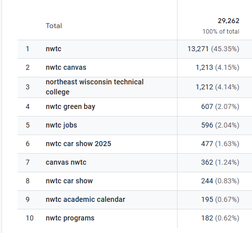
While it isn’t the top search, Canvas occupies two of the top 10 spots in search queries when looking for NWTC. Due to this somewhat large amount of people, including myself, I would argue to make Canvas access a larger portion of the site, or even placing it under Academics & Training or Student Experience. This would be better than nesting it a few layers under About NWTC.